The Details That Quietly Cheapen a Room
AI generated
Rooms rarely fail loudly. They fail in small increments. A cable left trailing across the skirting board. A curtain that stops noticeably short of the floor. A hard white bulb in a room that was meant to feel warm.
Most of these things can be corrected without great effort. That is precisely why they matter. Elegance in a home has very little to do with budget and a great deal to do with attention. The most beautifully furnished room can read as careless if the details are wrong, while a modest room can feel deeply considered when they are right. The aim is not perfection, nor a room in which ordinary life has been erased. It is simply to remove the small distractions that prevent a space from feeling settled.
What follows is not a list of things to buy. It is a list of things to notice.
1. Visible cables
Nothing interrupts a carefully arranged room quite like a cable draped across a wall or hanging untidily beneath a television. The eye reads it as unfinished work, and it undoes much of what the furniture was trying to achieve.
Begin with televisions, lamps and chargers, since these are usually the worst offenders. Cable trunking painted in the wall colour can disappear almost entirely. Adhesive clips can guide wires along the underside or back of a console rather than allowing them to fall down the front.
Where a floor lamp requires a cable to cross an open stretch of floor, move the lamp rather than simply accepting the wire.
2. Harsh overhead lighting
A single bright ceiling light flattens everything beneath it. Colours lose their depth, textiles appear less refined, and even a thoughtfully furnished room can begin to feel impersonal.
For living rooms and bedrooms, choose bulbs around 2700 Kelvin, usually described on the packaging as warm white. Cooler light may be useful in a home office, kitchen work area or utility room, but it rarely creates the softness required in a restful space.
In sitting rooms and bedrooms, use several sources of light at different heights rather than relying on the ceiling alone. A table lamp, a floor lamp and a picture light can create depth without overwhelming the room. A dimmer is also worthwhile wherever it can be installed.
Light placed near seated eye level is generally kinder than light directed solely from above.
3. Curtains of the wrong length
Short curtains are one of the most common errors in an otherwise pleasant room. Fabric that ends awkwardly above the floor, or hovers just below the sill without appearing intentional, makes the whole window feel smaller.
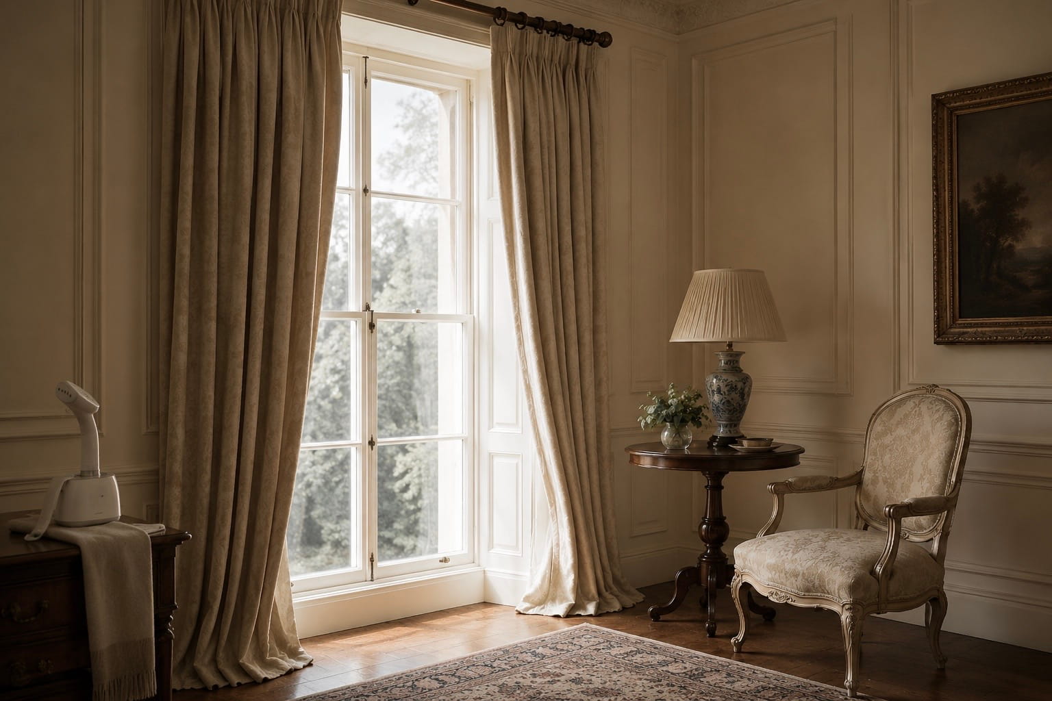
Full-length curtains should generally fall to the floor, either just meeting it or resting with a slight break of a centimetre or two. Hang the pole fifteen to twenty centimetres above the frame, or higher if the ceiling allows, and extend it twenty to thirty centimetres beyond the frame on each side. This makes the window appear wider and allows more daylight into the room when the curtains are drawn back.
AI generated
Not every window requires floor-length curtains. Café curtains, blinds and sill-length curtains can work beautifully when they are clearly suited to the architecture and purpose of the room. The problem is not shortness itself, but an awkward length that appears accidental.
4. Creased textiles
Cushion covers straight from the packet, a crumpled throw, or a tablecloth still marked by deep storage folds make a room feel temporarily assembled rather than properly arranged. A handheld steamer solves most of this within minutes and is often worth more to a room than another decorative object. Steam curtains once they have been hung. Press or steam linen cushion covers before placing them on the sofa. Wash and dry throws according to their care instructions rather than simply shaking them out. Natural materials do not need to look unnaturally perfect. Linen may retain some softness and movement. The distinction is between relaxed texture and the rigid creases left by packaging.
5. Overcrowded surfaces
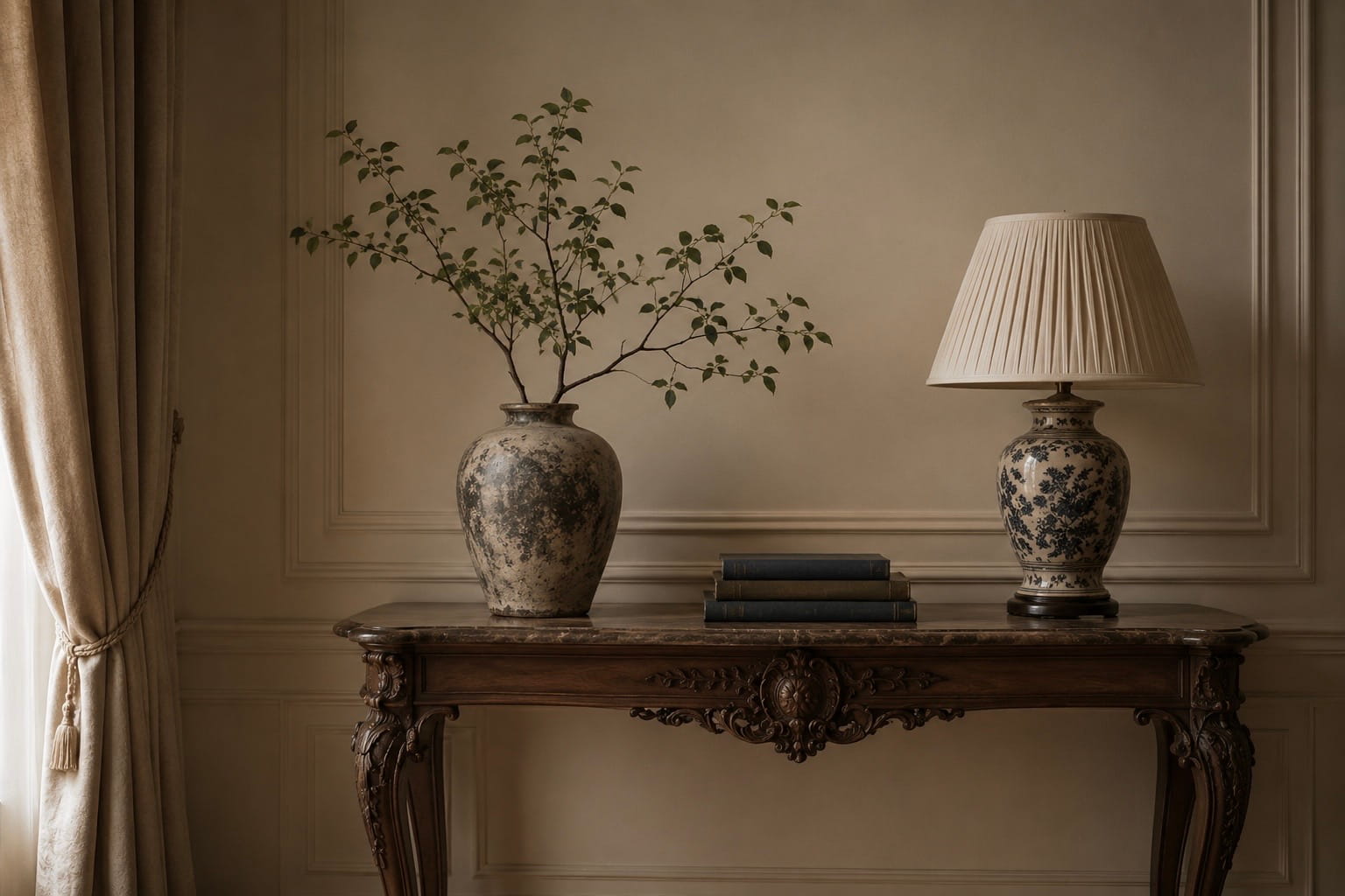
A console covered from end to end reads as storage rather than decoration. The individual objects disappear and become one layer of visual noise.
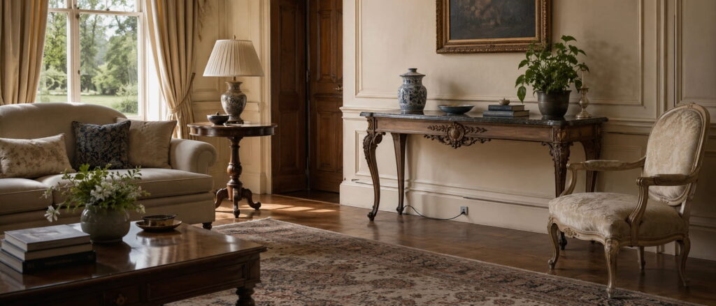
Clear the surface entirely, then return only what earns its place. Vary the heights and forms of the objects, and leave genuine empty space around each grouping.
Odd-numbered arrangements often work well, but they are a guide rather than a rule. Two substantial objects can be more effective than five small ones.
On a coffee table, three elements are often enough: something low and wide, something taller, and something living or organic. A tray can also turn a scatter of practical items into one deliberate arrangement.
AI generated
Empty space gives the eye somewhere to rest.
6. Plastic packaging on display
Washing-up liquid in a brightly printed bottle. Hand soap with a large commercial label. Cereal bags and packets crowded across open shelves.
Branded packaging is designed to attract attention across a busy shop aisle. That is precisely why it disrupts the quieter visual language of a kitchen or bathroom.
Decant everyday items where it is practical and safe to do so. Glass, ceramic and stainless steel containers reduce visual clutter, while a simple pump dispenser beside the sink can make an immediate difference.
Dry foods such as rice, pasta and oats can also be stored in clear jars, provided the containers are properly sealed and relevant dates or instructions are retained.
Products carrying important safety information, dosage guidance or specialist cleaning instructions should remain clearly labelled.
7. Art hung at the wrong scale
Small pictures floating alone on large walls are a frequent misjudgement, followed closely by frames hung too high.
As a starting point, hang artwork so that its centre sits roughly 145 centimetres from the floor. This is close to standard gallery height and usually feels comfortable to a standing adult. Treat it as a guide rather than an inflexible rule, particularly in rooms with unusually high ceilings or when the work forms part of a larger arrangement.
Above a sofa, bed or console, the artwork should relate clearly to the furniture beneath it. A single work or grouped arrangement spanning approximately two thirds of the furniture’s width will usually feel more grounded than a small frame placed in the centre of a large wall.
Leave around fifteen to twenty centimetres between the top of a sofa or headboard and the bottom of the frame. If a single picture is too small for the wall, group it with others rather than leaving it to float without context.
8. Neglected grout and hardware
Discoloured grout, yellowing silicone, a loose door handle, or hinges covered in layers of paint can quietly undermine even the most expensive materials.
These details are matters of maintenance, which is precisely why they are so revealing. They suggest a room that has been decorated, but not fully cared for.
Old silicone often needs to be removed and replaced rather than endlessly cleaned. Grout may respond to an appropriate oxygen-based cleaner, while a grout pen can refresh areas that remain permanently stained.
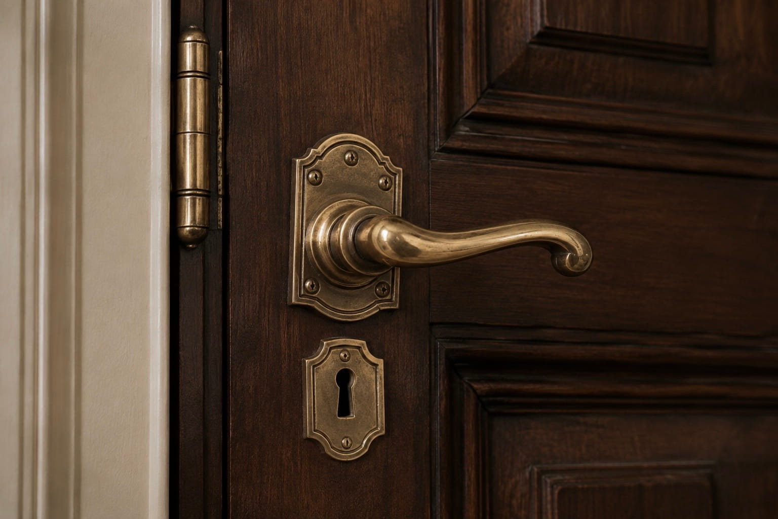
Tighten loose handles, knobs and hinges as part of an annual household check. A small screwdriver can restore a sense of solidity to doors, cabinets and furniture within minutes.
AI generated
Where hardware is beyond saving, replacing the handles in a single room can be one of the least expensive ways to make cabinetry feel considered again. Before replacing anything, however, determine whether the existing fittings are original or historically significant. Older hardware may need careful cleaning and repair rather than removal.
9. Too many unrelated metal finishes
Brass taps, chrome handles, black light fittings and nickel picture frames can coexist, but when every finish appears only once, the room may feel accidental.
There is no need for every metal to match, particularly in a room intended to feel collected over time. Historic and traditional interiors often contain several finishes, and their character can depend on precisely that variety.
What matters is repetition. Allow one finish to lead, then repeat any secondary finish at least once so that it reads as intention rather than oversight.
Warm metals such as brass, bronze and aged gold sit comfortably beside wood, stone and warmer palettes. Cooler metals such as chrome, nickel and steel often suit cooler colours and cleaner lines.
Mixed metals look most convincing when they share a similar degree of age or polish. Harmony matters more than uniformity.
10. Rugs that are too small
A rug floating in the middle of a seating area, with every piece of furniture standing outside it, makes the room feel smaller and less resolved.
At minimum, the front legs of the main seating should rest on the rug. Better still, place the whole arrangement on it.
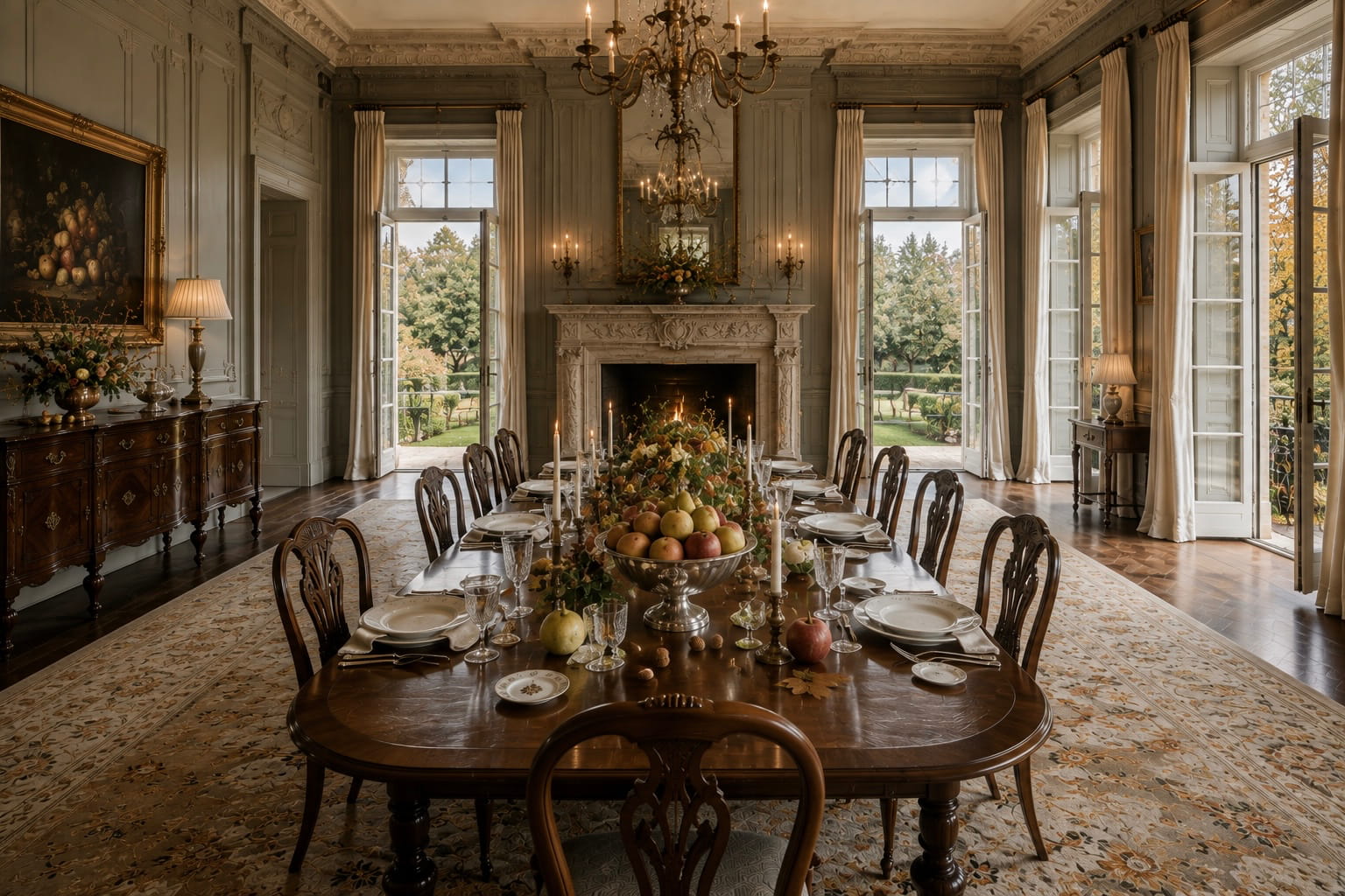
In a dining room, the rug should extend at least sixty centimetres beyond every edge of the table so that the chairs remain on it when pulled out. Larger chairs may require more.
Measure the room and mark the proposed dimensions with masking tape before buying. This reveals scale far more reliably than an online photograph.
A large natural-fibre rug with a smaller decorative one layered on top can also be a convincing solution.
11. Artificial flowers and dusty greenery
Poorly made artificial flowers become particularly obvious in daylight, especially once dust has settled into the petals and leaves.
For many people, fresh flowers belong naturally in a well-kept home. A single living plant, dried grasses, olive or eucalyptus branches, seasonal foliage or bare sculptural stems can complement this effect.
High-quality artificial stems can work in darker corners or rooms that are not used every day. Choose restrained, botanically convincing varieties and avoid arrangements that are excessively dense, brightly coloured or perfectly symmetrical.
Whatever you choose, keep it clean. One simple branch in a substantial vase will often contribute more than a crowded arrangement of imitation blooms.
12. Furniture pushed flat against the walls
Lining the perimeter of a room with furniture is an understandable instinct, but it can make a sitting room feel more like a waiting area than a place that invites conversation and encourages one to linger.
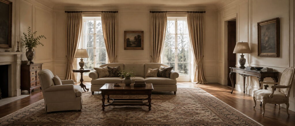
Where space allows, pull the sofa ten to twenty centimetres away from the wall. Angle a chair towards another seat, a fireplace or a central table rather than directing every object towards the television.
Allow the furniture to face inwards so that the arrangement forms a clear relationship. A rug, coffee table or pair of chairs can help establish the centre of the room.
AI generated
In a very small space, furniture may still need to sit close to the walls. Even then, chairs can be angled towards one another, and a properly sized rug or central table can connect the arrangement.
Where to Begin
Advertisement | Amazon affiliate links: Links marked with an asterisk (*) are affiliate links. If a purchase is made through one of these links, I receive a commission. This is at no additional cost to you. As an Amazon Associate I earn from qualifying purchases.
A simple place to begin is with three small changes.
Change the bulbs in the main living areas to warm white bulbs of around 2700 Kelvin. Steam the curtains and cushion covers. Decant the hand soap into a simple dispenser.
I have gathered a considered selection of home accessories, lighting and timeless details in my Amazon Ideas List.
Browse the Curated Selection for a Timeless Home*
Then choose one room and look at it without trying to redesign it. Notice where the eye is interrupted: a trailing cable, a picture hanging too high, a surface that has gradually become crowded. Correct one detail before moving to the next. A room rarely needs to be transformed all at once; it needs to be observed properly.
None of this is grand. That is rather the point.
A room does not become elegant through one significant purchase. It becomes elegant gradually, as each neglected detail is noticed, carefully addressed and brought into harmony with the whole.